Fresh new look: revamping Visual Radio Cloud
Visual Radio Cloud has a brand new look, including.. Dark Mode!

Jochem Vogel
Product Engineer
Visual Radio Assist always offered a top of the line user experience by moving the control surfaces of the software solution to the Cloud. With the Cloud dashboard we've enabled many new use cases for Visual Radio production in on-the-fly workflows or flexible network environments.
At Visual Radio Assist we strive to give the broadcast industry an interface with capabilities up to todays technological advancements, without compromising industry standards like colors or control flows.
New UI
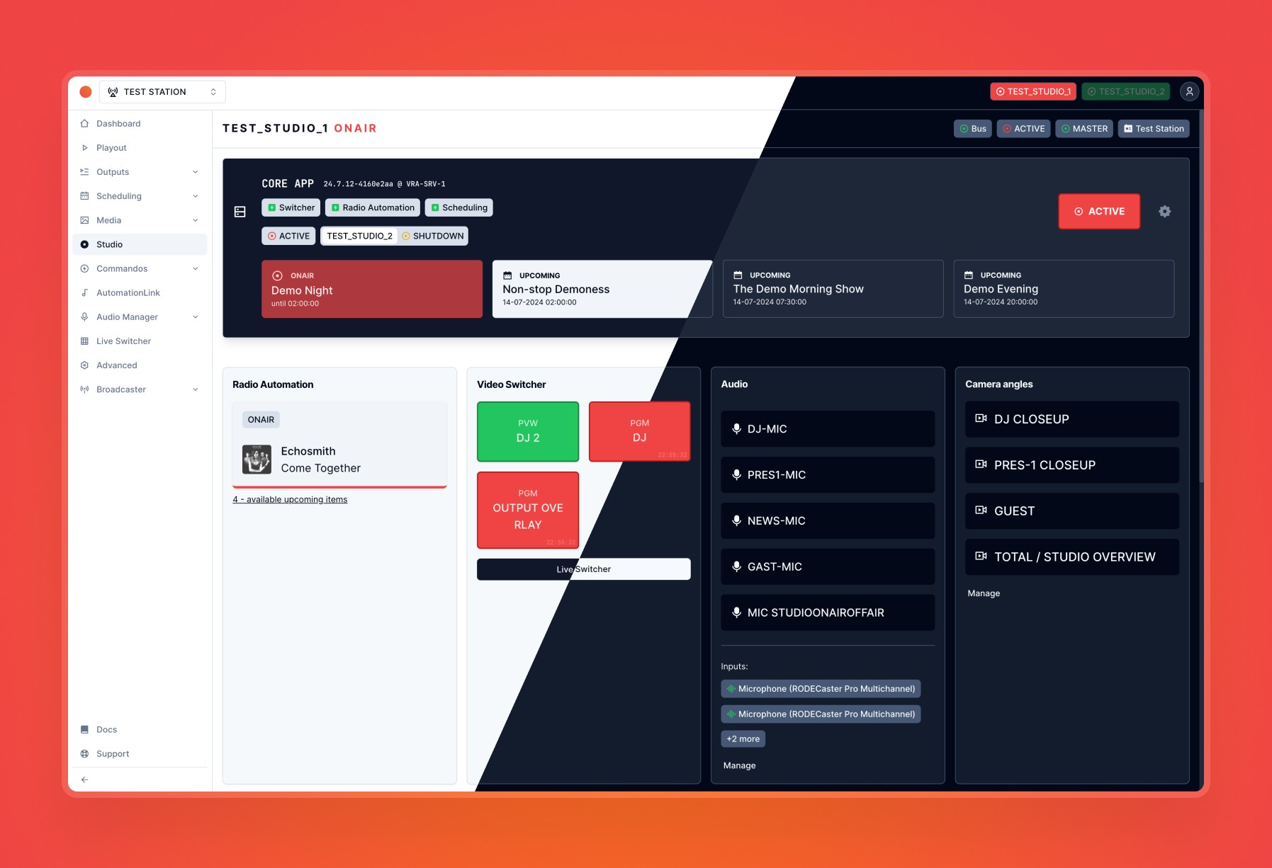
With the complete revamp of the "front-end", VRA Cloud introduces a more consistent and stable look. Every page, heading, text, button, input field and many other elements has been redesigned and changed. This revamp introduces some minor changes to elements of the product:
The navigation has a more modern look;
Tab navigation for subpages has been replaced by sub-items in the sidebar navigation;
Some icons have been adjusted;
Users can now choose between dark or light mode;
The styling of alerts and warnings has been updated;
Color contrasts have been improved in several areas;
Enhanced Accessibility and Control
The brand-new components bring other improvements with them as well. All input, dialog and other clickable elements are now fully accessible for keyboard control, which opens the road to full keyboard shortcut control in a future update.
With the new components and revamp we've also revisited the color scheme of the Cloud app. We made sure that the contrast ratio's are kept intact and all inconsistent colors were removed and replaced by a very consistent set of color swatches, to make the overall picture of the app more clean.
Dark Mode and Customization
As avid users of radio systems ourselves, we understand the preference for dark mode. The reduced glare and lower light emission of dark mode are easier on the eyes during long hours of work, especially in dimly lit studio environments. This makes it an ideal choice for radio professionals who often operate in low-light settings.
However, we recognize that not everyone prefers dark mode. To serve all users, the new VRA Cloud interface provides the flexibility to switch between dark and light modes. This ensures that you can customize your experience according to your personal preferences and the specific needs of your work environment.
Looking Ahead
The completion of the new the interface system for the VRA Cloud is not only visible in improvements at the front. The tools and workflow for developing new features or fixing bugs has been revisited. This means that we are now able to push out updates faster with the help of a more consistent color-set, components to choose from and error-safe deployment process to prevent silly bugs in production.
We would greatly appreciate it if you could take a moment to share your thoughts and feedback on the new design. Whether it's about the look, feel, or functionality, your input will help us identify areas for improvement and make the necessary adjustments.
If you like this kind of blog articles about the tech behind the product and Visual Radio, we can create more write ups about the real technical/engineering details behind VRA. Should we follow up with the tech blog?
Check out our public roadmap to see what’s coming next.
There’s plenty more on the way, so stay tuned for future updates. And if you like keeping up with the details, we also release a weekly changelog—a more technical breakdown of updates and fixes. It’s a great way to stay on top of the latest improvements.